A new normal? Maybe we need to start thinking about what it will be like in this brave new world – living with COVID19 for years to come.
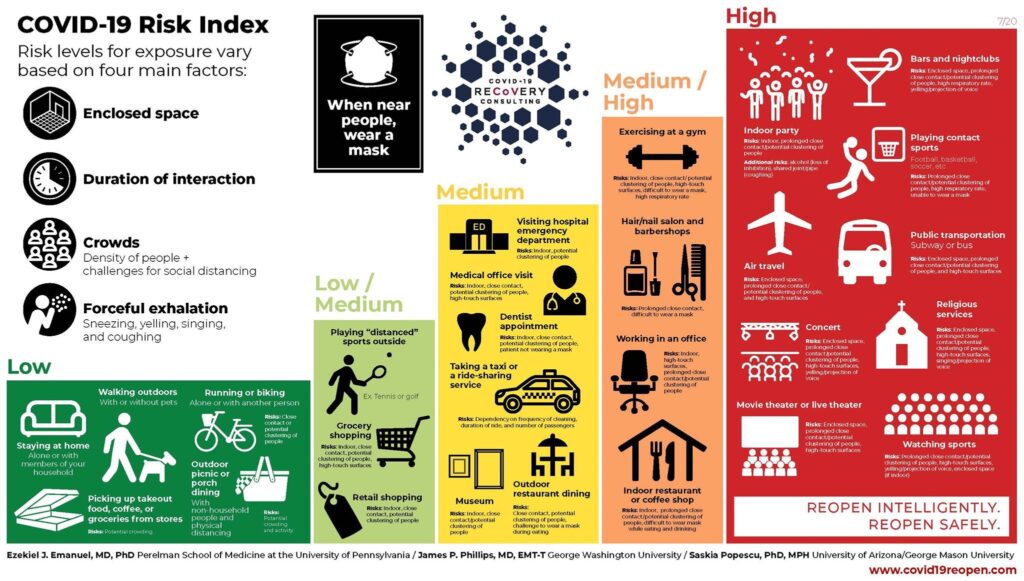
An easy to understand infographics with color coding to indicate which situation pose the most threat to us.
Thank you to three public health experts. Ezekiel J. Emanuel, chair of the department of medical ethics and health policy at the University of Pennsylvania, and formerly an adviser in the Obama White House, James P. Phillips, a physician and the chief of disaster medicine at George Washington University Hospital, and Saskia Popescu, an infectious disease epidemiologist at the University of Arizona.
Story behind this infographic can be found here.
https://www.wired.com/story/to-navigate-risk-in-a-pandemic-you-need-a-color-coded-chart/